Directed Acyclic Graph
Use the generated DAG to get an overview of your Data Pipelines
A directed acyclic graph (DAG) is a collection of nodes and edges. Edges connect nodes to each other and represent a relationship between the connected nodes.
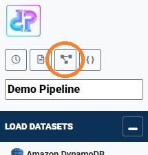
You can view the DAG for your data pipeline by clicking the DAG button in pipeline builder view (Figure 1).
Your data pipeline may contain hundreds of steps and can become hard to read just by looking at the sequence of operations in the pipeline builder. The DAG helps you to get a quick overview.
Take for example the following two steps in Figure 2.
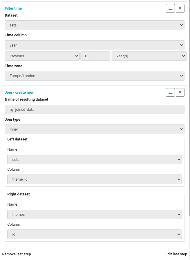
The two steps are Filter time and Join. Note that the join will create a new dataset. The DAG generated from the above steps is shown in Figure 3.
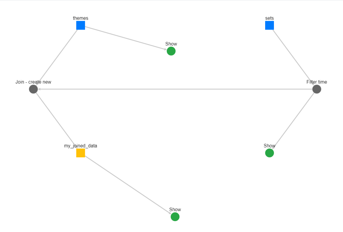
In the above example, there are two source datasets (blue squares) and two steps (grey circles). Note how the Join operation is represented in the DAG. It is connected to a source dataset themes and an operation Filter time that is connected to a source dataset sets. This is because the Join is between the unchanged themes dataset and the sets dataset after the Filter time operation has been applied to it.
The Join operation yields a new dataset, my_joined_data. This is not a source dataset so its representation is different, a yellow square.
The green circles titled "Show" indicate what is shown in the preview. These are:
- sets (with Filter time operation applied)
- themes (unchanged)
- my_joined_data (result of a join)
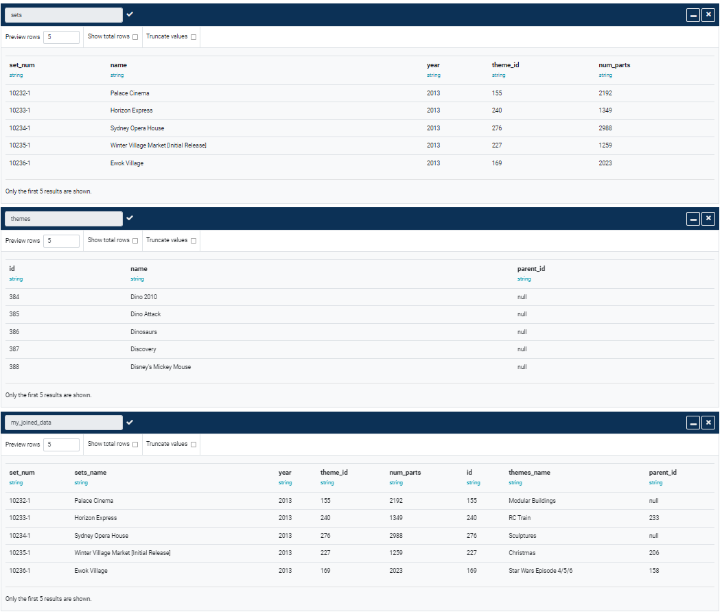
So in the Preview column you will see three datasets (Figure 4.):
The DAG view is auto-generated from the data pipeline every time the pipeline is updated.